

Not sure how many of you have ever been “speed dating”… personally, I haven’t BUT one of my family friends has done it in the past and I actually had the chance to see this in person when I went to some restaurant for lunch last month. And honestly… It looked pretty damn fun! Maybe you’re a marketer or designer or maybe you’re a business owner wondering how this might even apply to you… Don’t worry ladies and gents’, I’ll get to all of your concerns… 😛
One of the easiest analogies for this “above/below the fold” phenomenon is actually speed dating! I’ll mention that first.
Seems like a stretch for an analogy? Ha, I agree! Continue on, buddy o’ pal…
Quick recap of speed dating: usually, everybody gets a minute or two to formally meet with every one of the opposite group and then afterward, people are allowed to mingle and talk to one another. People usually end up talking to the person they got along with the most and were most attracted to.

Hopefully not like this youngster, I believe in him! 🙂
Now, because you know you’re not going to spend hours and hours with each individual person, but just minutes with them (sometimes less than a minute), you can only subtly communicate and sub-communicate so much info about yourself. And generally, if you can present yourself in a way that is appealing, people will associate good emotions with you, thus increasing the chance that someone will want to stick around!
Anyway, in speed dating, this challenge of subtly and quickly presenting yourself in the MOST appealing light possible applies just as much for your company’s website… I can’t care less if you’re a business owner, developer, designer, marketer… whatever… I’ll start out more “high-level” stuff (for you business owners out there) then get down to the nitty-gritty.
So what the heck does “above the fold” even mean?
You remember those things that we used to get all of our news from…
Oh yeah! A newspaper… 🙂
Anyway, in the early days of publishing, the term, “above the fold” meant all the news/content that appeared on the top half of the front page newspaper.

Publishers knew that their top stories and headlines absolutely had to appear “above the fold” to attract reader’s attention… If successful at this, it would increase the chance of convincing them to take action (*cough* by buying the damn paper).
And yeah, nowadays, publishers have moved their businesses online and as web design evolved, the term “above the fold” continued to stick.
Thus, this post… No duh! 🙂
In today’s world, the “fold” no longer refers to the actual fold/crease of a newspaper, but the bottom of a browser window.
Everything “above the fold” is the top portion of a web page that is visible in a browser window when the page first loads.

And, uh… Newsflash: people that visit your website spend 80% of their time “above the fold” and only 20% of their time “below the fold” (according to an eye-tracking study).
To add onto that, HubSpot found that 55% of people, on average spend less than 15 seconds on your website.
Soo what does this all mean?
Ahh, the juicy part!
For you business owners wondering what you should know about this topic, it’s this: everything on a webpage that appears above the fold is prime real estate!
In other words, it gets the most attention from users and it’s what they see first! That’s why it’s arguably one of the MOST important aspects of any webpage...
And because of this, the content placed above the fold must accomplish the following:
- Immediately grab the person’s attention
- Present them with the most important AND relevant content they’re looking for (so they don’t quickly go to another site)
- And urge them to take the next step (keep reading, fill out a form, etc)
Yeah, then they’ll get really sucked in… sorta like this actually!
So, basically… make everything “above the fold” really count.👌
Like… a lot!
Now to the “nitty-gritty”🔬
Oh boyy!
The rest of this post is more about the nitty-gritty of exactly what to put above AND below the fold and the best practices. *I know, if you’re someone who loves working in the trenches, the rest of this post will be especially neat-o!*😉
And no, unfortunately, there aren’t any awards for being a master at “the fold”, but it’s definitely a valuable skill!
Let’s start off with the most important place to begin…
Can you guess?
Ha! Too late, I’m spoiling it: the first step is knowing the end result you want people to take.
Whether it be a form you want people to fill out, a download, an opt in… whatever it may be, there are two rules you generally want to follow to increase the percentage of people take who will action:
Rule #1: Keep your CTA above the fold if your business is either well-known/common or if the solution is not novel or new (which isn’t a bad thing btw).
“Well-known” businesses are like plumbing contractors, chiropractors, or agencies – they’re businesses that people are already familiar with.
Same thing goes for the amount of explanation you need on the particular webpage: adding too much explanation for an offering that isn’t something new may actually hurt conversion rates – which is what we’ve seen.
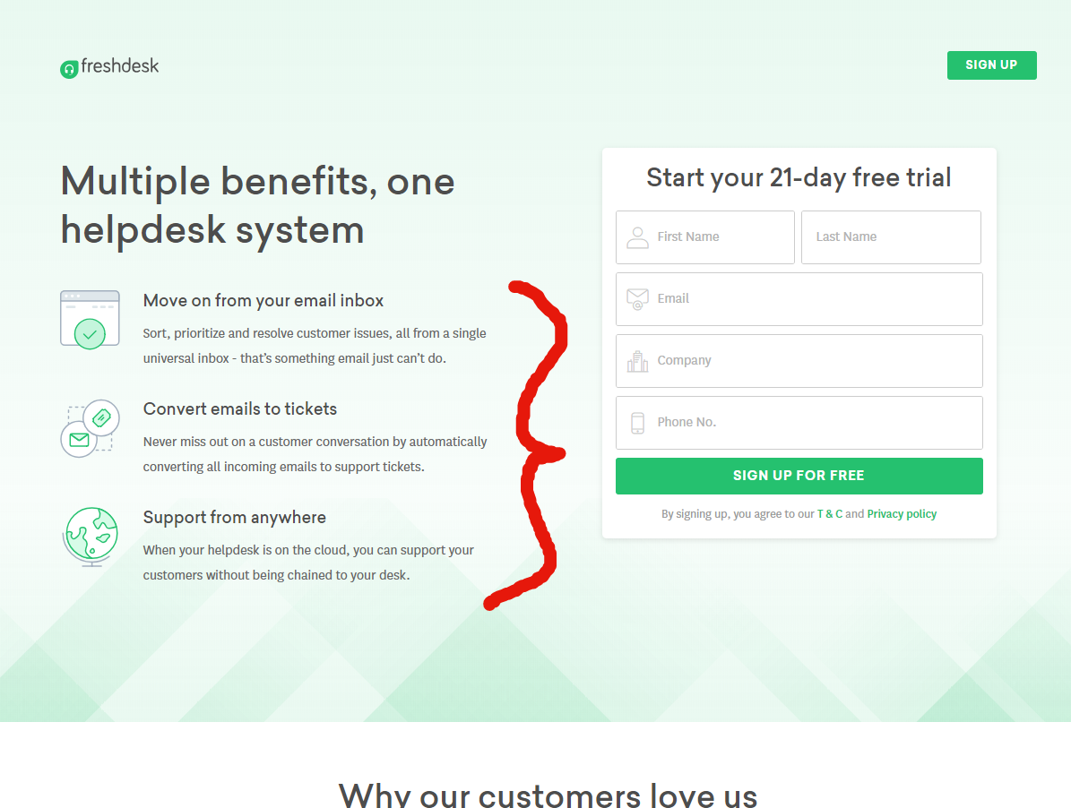
Rule #2: If your offer is something brand-spankin’ new that has never existed previously, then you will very very likely benefit from keeping your form or CTA below the fold.
In this case, having a longer page with more explanation will almost always benefit more.
So here’s the rough “template” we personally follow in cases like this:
- Peak curiosity above the fold
- Have a longer landing page for more copy where, naturally, the person will need more convincing
- Have the form or whatever CTA below the fold.

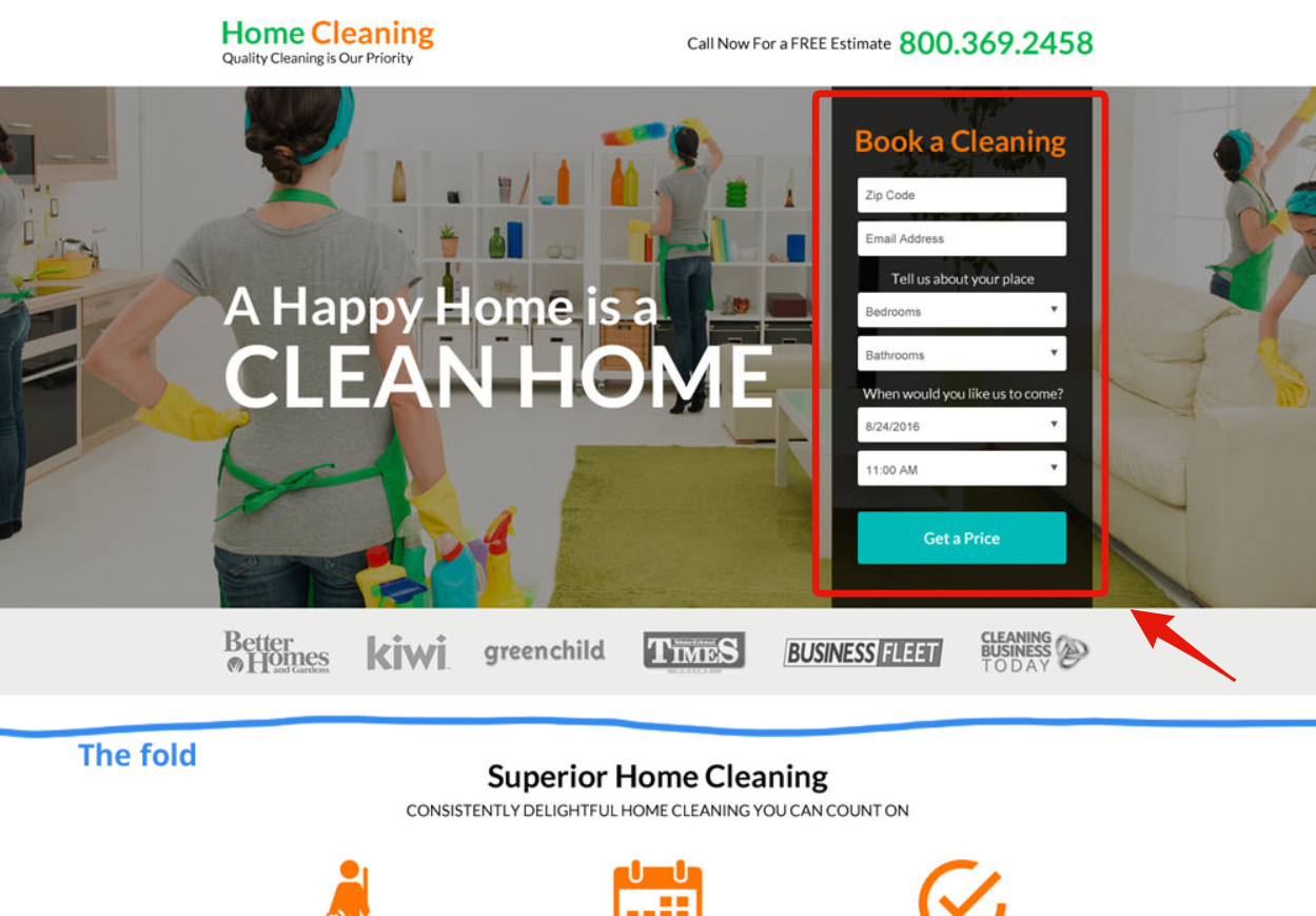
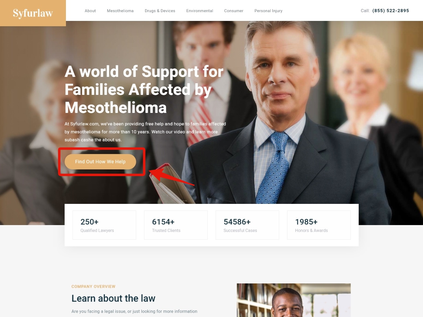
Perfect example, no CTA above the fold😮
Really think if this applies to you too… Maybe it does more than you think.🤷
The health and supplement industry relies heavily on persuasion which means… *cough* what I just listed above^^. Fear, nervousness, and anxiety play a pretty damn big role before people feel safe enough to take action, so it only makes sense to have a longer page!
Ha! Sort of like this
Now that you know these two rules, it’s time to dissect… the “fold”.
Quick anatomy of “above the fold”👨⚕️
No, that didn’tt say, “anatomy of a landing page”…
This is strictly what goes ABOVE the fold.
So what actually does go above the fold?
1st, know the final action for the page…
Figured that out? Cool!👍
Next, use the two rules I explained in the previous section so you know if your CTA should go above or below the fold. And the anatomy is actually pretty simple so I’m not going to go crazy deep on this.
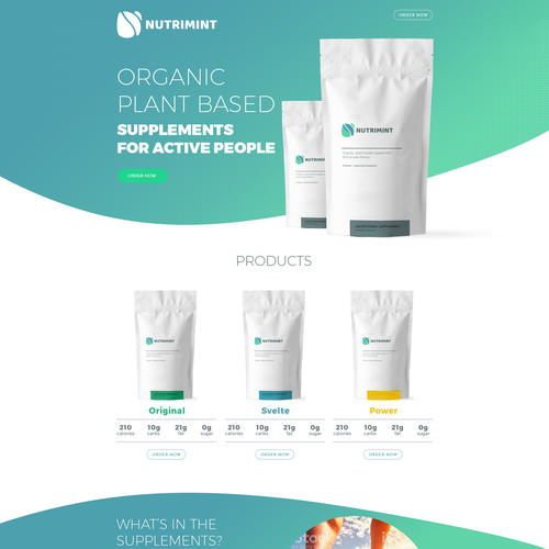
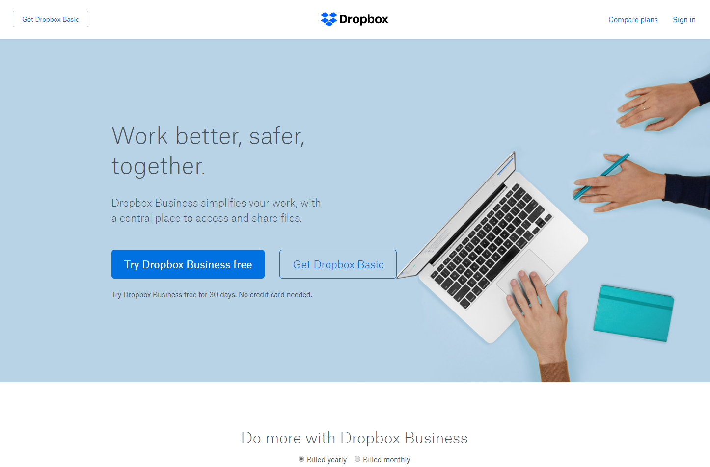
Logo:
uh… not even going to explain, this one is a no duh. Yeah, you need it loud and clear.
Your header:
Oof, this one is important.
I could go on forever about the header so let’s keep this simple: your header text should not only pique curiosity and be short (3-6ish words), but it should also mention the benefit and even give a good idea of what your business is about.
The examples below do a pretty good job at showing this. Honestly, just look at good headers from various businesses and landing pages and that’ll help you a ton!
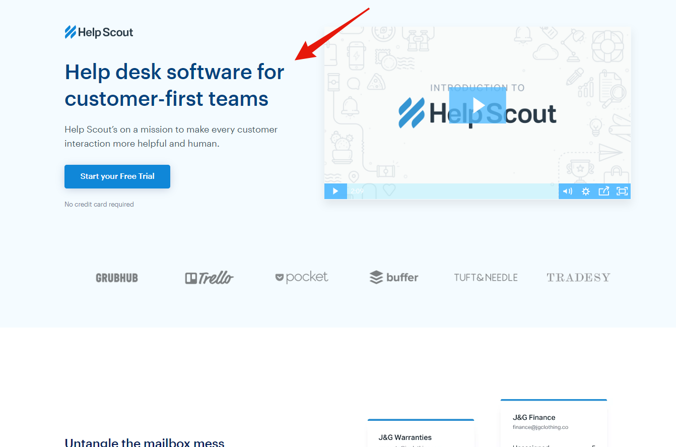
Ahh, see how damn clear this is?
Sub-heading / explainer text:
Unless it’s 100% clear what you do from your header, the vast majority of the time you’ll need to provide some sort of explainer copy to accomplish one or more of the following:
- Justify the person’s fears
- Explain the benefit more in-depth (make it more irresistible)
- Explain your offering in more detail
…the goal here is to raise the interest level so people will continue reading and exploring.
It’s just so… peacefully clear!
The controversial navigation bar:
Yessir, depending on what you’re trying to accomplish, the navigation bar can actually vary! You may decide to be very minimalistic and just have your logo and a single button or you may choose to have many links.
…Or hell, maybe you might decide to have no navigation bar at all!
It all depends on the goal really. If the action you want them to take is more simple and straightforward (like a pdf download), then eh… probably having fewer links in the navigation bar or having NO navigation bar will convert better.
*Again this is what we’ve seen MOST of the time*
Give the person the information they want to know before they even know what they want to know. (<— P.S I absolutely love this line for some reason, sounds super wise🤓)
That “extra” content:
Alright, when I say “content” in this context, I’m talking about the additional content you can put in the extra space you’ll usually have available to you above the fold. And there’s a lot of freedom of what you want to put here and honestly, this varies case by case.
It’s up to you to split-test and determine what is best to put in that extra available space.
Social proof: real testimonials will first name, last name, photo of person skyrockets social proof. You can also show the number of product reviews. See examples below!
You can list the benefits…
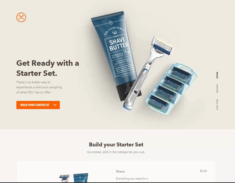
You can SHOW product being used…
Show what’s included in the product…
Show the “after-effect” / end result…

Once again, the goal is to get the person more invested. Think about what info someone would want AND need to know to be one step closer to taking that action.👊
…Or is it all a myth?👀
I’ll be honest, there’s a secret I’ve purposely been holding back (sort of): some people say the “the fold” is actually a total myth.
Do I believe “above the fold” is a myth?
Thanks for asking! 😛 Hmm, yes and no is my answer.
(Oh I know, that’s the answer people hate hearing ha!)
It’s a fact that 80% of people spend their time higher up on the webpage. I can also tell you if the top of your webpage – everything above the fold – is ugly garbage, then that WILL hurt conversions.
So then what’s the reason for some people not believing in “above the fold”?
Haha, dammit I mean there’s even a website about it! http://abovethefold.fyi/
People who don’t believe in “the fold” usually value something even more: congruence on the web page.
And hey, they’re not wrong at all actually!
Congruent and captivating content located above the fold is extremely important (also in my own experience for our own clients).
Here’s my conclusion: yes, make your entire webpage congruent… BUT at the same time, if you can do an extra good job at grabbing people’s attention at the beginning, MORE people will continue on.
…there’s proof of this working now, just as it did in the “olden days” with newspapers!📰
So ensure that your messaging and content is inviting and concise.
Look at it this way: it’s like a great story being told. You can begin by telling that amazing story with a bad initial hook, but then fewer people will listen. Or you can start that amazing story with a really great hook, and more people will stick around.
(which strengthens the entire story)
Get it? Read that again^

Do that and you’ll have everyone engaged as hell… unlike this little guy
See how that works? This is what it comes down to.
Hopefully, this helps and I shed some light on the fold. The “fold” isn’t given enough love in my opinion so I’ll do my fair share 🙂
Take care!
